Mobile First Index: what you should know about it to be 100% prepared
6 July 2017 2 Comments ON-PAGE SEO, TECHNICAL SEO
The popularity of mobile devices increased dramatically over the last several years. We all love our mobile devices and spend countless hours surfing the web through our smartphones and tablets. According to the statistics, we tap, swipe and click some whooping 2,617 times each day. There is even a specific term to describe our fear of losing these devices, it is called “nomophobia.”

This unusually high rate affected the way people search and visit websites. It means that owners and designers of websites, in turn, should reconsider their view of websites along with approaches to the search engine optimisation. Nowadays, much more attention should be paid to the mobile experience of users and creating SEO-friendly content for new mobile formats. Simply put, if you do not follow emerging trends, your project is likely to miss the boat.
In this article, we will try to explain what scary words “Mobile First Index” really mean and how to get your website prepared for this Google’s novelty.
What is Mobile First Indexing?
First of all, let’s figure out the difference between “Crawling,” “Ranking,” “Retrieval” and “Indexing.”
- Crawling stands for the process of discovering pages by Google through following links on the web.
- Ranking refers to the position website holds in the search engine result page.
- Retrieval. In simple words, it is the first and foremost part of a search query. During retrieval, the search engine requests data that might be relevant to the query. It’s probable that Retrieval and Ranking are being simultaneously processed by the algorithm.
- Indexing happens when Google makes a copy of your website in a format that is useful to the ranking algorithm.
Now, after all clarifications are being made, we can address ourselves to the Mobile First Indexing. What does it mean? It is pretty much what it sounds like. Not a long time ago, Google announced that they would primarily consider the mobile version of a website to be ranked. It apparently means, that those who optimised their websites for mobile use, will be ranked better than those, who did not. Moreover, the site that works well on the mobile phone will be ranked well on desktop as well. On the contrary, if your website is not adapted to the needs of mobile users, your rankings will probably sink not only on mobile (which is obvious) but also on desktop.
Even though Mobile First Index is still to be rolled out, it will be not long in coming. At the recent SMX conference that took place in Seattle, Gary Illyes, head of Google Search, pointed out that 2018 would probably be the year of MFI’s (Mobile First Index) implementation. Noteworthy he added that people still have several quarters to make necessary changes for the arrival of the new algorithm. So, you still have some time to figure things out, and the team of RankActive is happy to help you with that.
It is obvious that now mobile friendliness is Google’s number one concern. But the question is what counts as “mobile friendly”? The simple answer is any page that views “properly” on a cell phone. Nevertheless, this definition only partially covers the topic. So, let’s dig deeper into the issue of mobile optimisation.
To begin with, you should understand where you stand. There are two major ways to define if your website is mobile-friendly.
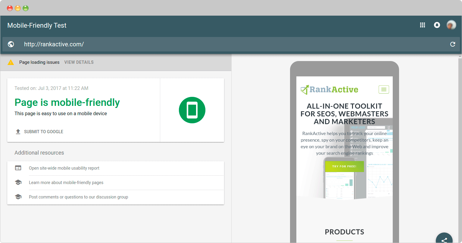
1Mobile-Friendly Test tool. Developed by Google, this feature allows users not just to figure out whether the page is mobile-friendly or not, but to view page loading issues. In addition to that, you may check how users see the particular page on a mobile screen. It is important that Mobile-Friendly test is not difficult to run. Just enter your Url and click “Run Test” button.
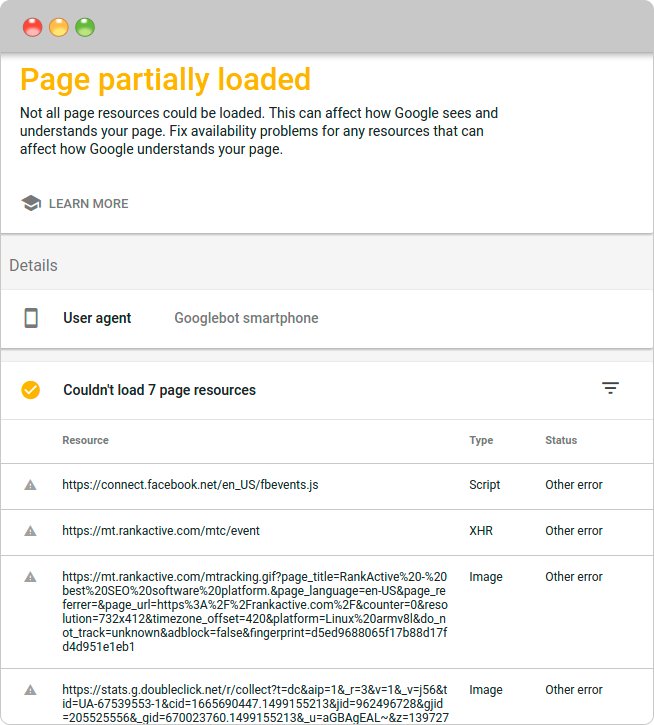
As you can see, after checking you can get the list of issues that occurred during the test. It is clear that these errors can negatively affect the mobile-friendliness of your website. In addition to that, here you can check resources where the issue was detected and then prioritize them by type and status.
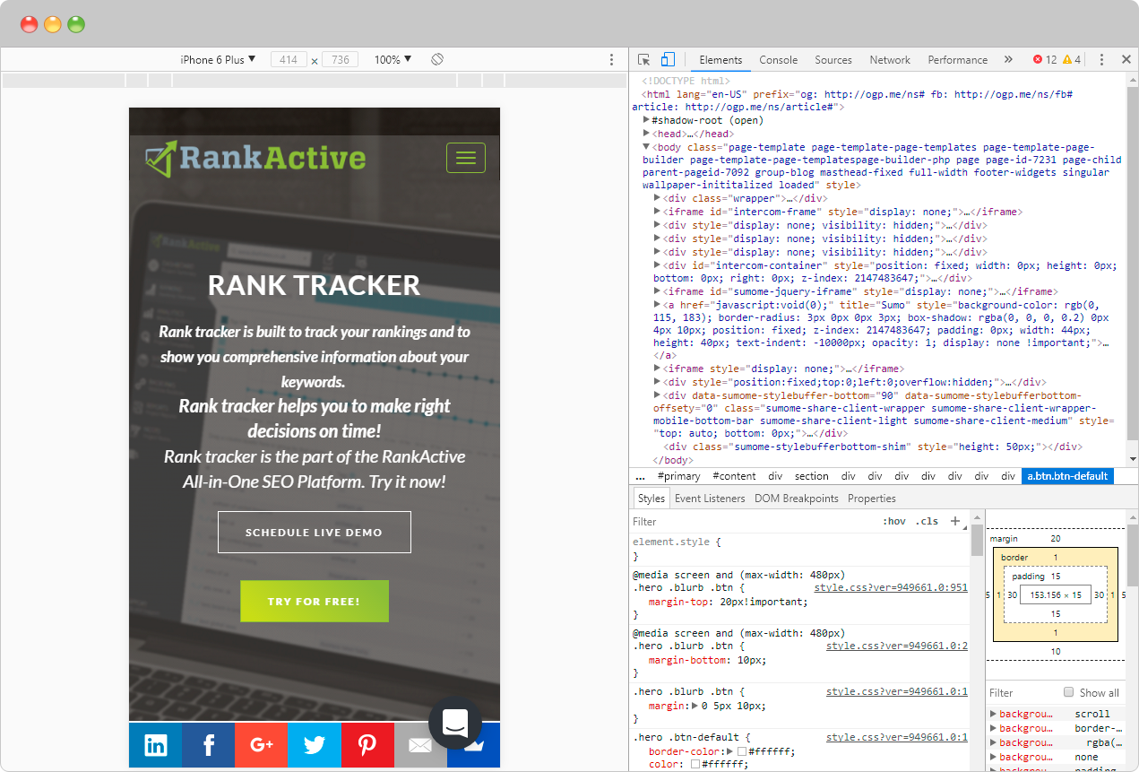
2Toggle device toolbar. This feature allows you to see how users view the website on their mobile devices. Check it out by using “Ctrl+Shift+M” in the “developer tools” mode. Here you can choose from a variety of mobile phones with different screen resolutions, rotate, zoom the image and interact with website’s interface.
Your website got a negative result on Mobile-Friendly Test? Or it just does not look good on mobile screen? Don’t be upset: we have prepared few tips on how to get ready for Mobile First Index.
1. Use responsive design
If you want to rank well on the Mobile First Index (and we are sure that you do), this is the most important step to take. What makes the responsive design different from what we usually see on the web is that they rank well on both mobile and desktop. This occurs through design changes that have been made in order to make the page fit the size of the screen. Simply put, the responsive website responds the needs of users and their devices. If you use a computer, you can easily check your website for responsiveness by reducing the size of the window from full screen down to very small. If the appearance of the text, images, and menu changes as you get smaller, the site is responsive.
Let’s take a look at the typical example of a responsive website: www.vam.ac.uk.
At the same time, term “responsive design” should not be confused with what is called “mobile-friendly design.” Unlike responsive websites, mobile-friendly ones are designed specifically for mobile users, but look almost the same way both on desktop and mobile. By giving preference to the responsive design, you provide your users with the best online experience no matter what device they use to visit your page.
If you want to get high rankings, you need to implement responsive design. To be a little bit ahead of the curve, you can try a free course of responsive design by Google or follow these pieces of advice provided on the developers.google.com.
2. Make your content mobile-friendly
It is not enough to design a mobile-friendly (or responsive) website, a content of the site should also be appropriate. The thing is that mobile users want to have the same content experience that desktop users are having. We know you want to give them such experience, so we strongly recommend you to take following steps:
- Shorten the text. 4000 words article looks extremely difficult to read even on desktop, let alone mobile devices. You should reconsider the size of your text content in order to make your content accessible for mobile users.
- Use different types of content. Want to keep scribbling long-reads no matter the cost? Think about breaking your paragraphs with additional content types. Use videos, audios, beautiful imagery, etc. Such content can significantly improve user experience, and a transcript can be included on the page to ensure the maximum impact for SEO.
- Move onto infographics. With infographics, you can turn any boring or complicated topic into an easy-to-digest piece of visual content. According to the statistics, visualised data is 40 times more likely to be shared on social media compared to other kinds of content.
- Avoid Flash. Latest models of mobile phones do not support Flash. Apparently, you do not want to cross millions of people off your visitor’s list, so use HTML5 instead.
3. Take the bull by the horns with Accelerated Mobile Pages (AMP)
Although Accelerated Mobile pages are still HTML pages, they follow the specific layout that allows them to load faster on the mobile devices. AMP is supported by Google and some other huge brands and is easy to use through WordPress plugin. All it takes is just to enable it.
Yes, Accelerated Mobile Pages load faster and thus can help you to get some extra traffic for your website. In spite of that, Google claims that AMP is not a ranking factor. But never say never, it still can become a search ranking signal when it is more widely launched. So it’s better to get yourself prepared and test it. This official tutorial will help you with that.
4. Get rid of N1/Faulty redirects
N1 redirect is no different from faulty redirects that are responsible for directing you to a page you did not intend to visit.
Not a long time ago it was a common practise to redirect mobile traffic over to the mobile home page. Let’s say, you are trying to view this blog post on your mobile device, but something redirects you to the homepage, which you did not want to visit. It’s irritating, isn’t it? This is no surprise that Google will pose sanctions on such websites.
What we recommend you to do is to redirect mobile traffic to the equivalent mobile web page. This will not only improve experience users get when surfing your website but can stand you in a good stead in preparing to the Mobile First Index.
What if you do not have any mobile website at all?
According to the insights that Gary Illyes revealed at SMX Advanced, desktop content will still be indexed. The mobile crawler crawls everything, not just mobile-friendly pages. Of course, they won’t rank as mobile-friendly, but it has nothing to do with Mobile-First Index. They were not ranked this way before and so they would remain. Such websites are already ranked lower compared to those optimised for the mobile devices, and this will not change. Noteworthy, Gary explained that implementation of MFI would probably take some 4-5 years.
Conclusions
We are entering a new age of Web design and SEO. There are a lot of innovations now, and there will be a way more of them in the future. Mobile First Index is just one of the numerous changes that are almost here. While it is not yet implemented, we should cut the chase and meet upcoming challenges with confidence.
In this regard, providing your users with the best mobile experience is now more important than ever before. Note, that 51% of Internet users view websites on mobile. You just cannot ignore that any longer. When developing Mobile First Index guys in Google didn’t think of placing your project between a rock and a hard place. They are doing that in order to make sure that your visitors get the top notch experience while surfing the website.
From our part, we want to help you to stay on the top of things. Use responsive design, create mobile-friendly content, try accelerated mobile pages and you will surely be 100% prepared for new challenges that come along with Mobile First Index.
Tags:
Like this article? There’s more where that came from.
- 4 Steps Guide to Using Google Analytics for Social Media
- Setting up of the trigger to be notified when your ETV reaches the goal
- How to Get Out of Google Sandbox and Do It Quickly?
- Geolocation Redirect 101: How to Secure Your SEO Localization Efforts?
- Your Ultimate Guide to SEO Reporting with RankActive
- Your 7-Step Guide to Increasing Page Speed


Erin July 17, 2017 at 15:11
Great article, I think it’s important for designers and developers to develop with a “mobile first” approach rather than considering mobile as an afterthought.
George Svash July 18, 2017 at 12:47
Thanks, Erin. You can now keep ahead of changes 🙂